It's time to talk some more about type! Our last Typography 101 blog brought you some fun facts about serif typefaces. This time we're switching gears to the other most broad type classification: sans serif. Just like serif typefaces, there are many different styles of sans serif type to explore. Let's get going!

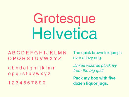
First up is the grotesque style. Grotesque typefaces were the first commercially popular sans serif typefaces. Their characteristics include a more upright axis and a uniform stroke. There is a slight squared quality to many of the curves and the letters have modern proportions.
Probably one of the most famous sans serif typefaces, Helvetica was developed in 1957 by Max Miedinger and Eduard Hoffmann in Switzerland. It was designed specifically to be neutral with great clarity and to have no intrinsic meaning in its form. Helvetica has become one of the most widely used and recognizable typefaces of the modern age. In 2007, director Gary Hustwit released a documentary film about Helvetica and MOMA in New York also displayed an exhibit from April to March of the next year, dedicated to the typeface.

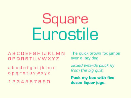
Square typefaces are generally based on grotesque character traits and proportions, but have a definite squaring of normally curved strokes. They usually have more latitude in character spacing as well.
Eurostile was first released under the name Microgramma in the early 1950’s by designer Alessandro Butti and his assistant, Aldo Novarese. Microgramma contained only capital letters and was renamed Eurostile in 1962 when it was re-released by Novarese with lower case letters. The rounded corners of the typeface are said to resemble the early television sets of the 1950’s & 60’s. The symmetrical and architectural qualities or Eurostile have made it a popular display font since it’s creation.

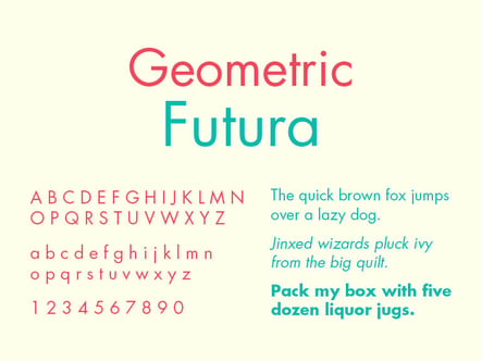
Geometric sans-serif typefaces, as their name implies, are based on geometric forms. Strokes have the appearance of being strict monolines and character shapes are made up of geometric forms.
Futura was created in 1927 by Paul Renner and was inspired by the German Bauhaus movement. Although Renner was not a member of the Bauhaus, he shared many of its views, believing that a modern typeface should express modern models rather than be a rival of a previous design. Futura has been widely used in corporate logos, films and advertising. It even had the honor of being the first typeface on the moon, chosen for a commemorative plaque left by the astronauts of Apollo 11 in 1969.

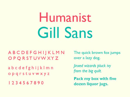
Humanist type characteristics include proportions that were modeled on old style typefaces, open strokes and a slightly higher contrast in strokes in comparison to other sans-serif typefaces.
Gill Sans was released in 1928 by artist, sculptor and designer Eric Gill. Often called the “Helvetica of England,” the design of Gill Sans stems from Edward Johnston’s iconic typeface, Johnston Sans, created for the London Underground in 1913. Gill studied under Johnson, and created his typeface with the goal of improving upon his predecessor’s work. Gill’s humanist lettering is based on classic roman proportions, which give the sans-serif a less mechanical feel than its geometric contemporaries. Gill’s work as a sculptor is very visible in his letterforms.
We hope you've learned a lot about serif typefaces from reading this post. Stay tuned for our next blog in this series: all about scripts.
Want more typography fun? Click the button below and we'll mail you a FREE 2015 typography calendar.

