As a graphic designer, I often have to answer some version of the question: "Why does the color on my screen look different than the color that's printed?" The best way to avoid this problem is to have a strong understanding of the different color modes and their uses.
RGB vs CMYK
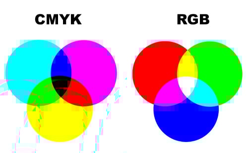 RGB stands for Red Green and Blue which are the primary colors of light. Light emitting devices, like a computer monitor, digital camera or television all use the RGB color space. RGB has a large color gamut and produces a wider range of colors than printing can produce. Often times images on the screen made out of RGB can appear brighter and more vibrant than they will be once they're printed in CMYK. CMYK stands for Cyan Magenta Yellow and blacK which are the 4 process colors and inks used in printing. Various combinations of these inks are used to create the colors in the printed spectrum. The appearance of the inks can also vary depending on the type of paper used in printing. Coated papers lend themselves to brighter colors because the ink sits on the surface while uncoated papers absorb the ink and can be more muted. It's important to work in CMYK mode when designing a piece for print to ensure you achieve the most acurate color possible. Below are 2 versions of the same image, one uses the RGB color space and the other uses CMYK. You'll notice there is a significant difference between them.
CMYK Version

RGB Version

Spot Colors

Spot Colors are specifically mixed inks. The most widely used spot colors are those from the Pantone Matching System (PMS). Each Pantone color corresponds with a number for reference. Spot colors are commonly used so that a brand remains consistent. Some spot colors can be made using CMYK while others require that the specific ink be used. Our HP Indigo 5500 is a 7 color press, meaning we can run CMYK as well as 2 additional spot colors all at once.
We hope you found this blog colorful and informative. What's your favorite color?