Here is our list of 5 common print and graphic design terms that every graphic designer and print buyer should know.
1. Bleed
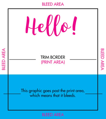
Bleed is arguably one of the most important printing terms that we feel every graphic designer and print buyer should know.
A bleed is the zone beyond the trim size that should be used when an object in your document is meant to go to the edge of the printed page. Using the bleed margin allows your print service provider to cut your piece to the correct size and keep your image right to the edge of the page without white space showing. A standard bleed margin is .125”.
For more information on creating a bleed please check out these helpful resources right on our site: Let it Bleed & How to Create a Print Ready PDF.
2. CMYK
CMYK, or Cyan, Magenta, Yellow, and BlacK are the ink colors used for making all the colors in printing. When designing a full color project for print, digital or offset, be sure to design it in CMYK. This will give you the most accurate color representation of what your piece will look like when produced. Knowing the difference between RGB (Red, Blue, Green) & CMYK (Cyan, Magenta, Yellow, BlacK) is important. RGB is for screen display and CMYK is for print. Learn more from our post RGB, CMYK, Spot Colors: What You Need to Know.

3. DPI
DPI stand for Dots Per Inch. If you are sending a design, piece of art, or photo to print you want to make sure your image resolution is minimum of 300 DPI. What does that mean? Well, DPI actually starts as PPI (Pixels Per Inch) which is the amount of pixels present within a span of one inch. When using the digital image for print, PPI then translates to DPI, dots that will print per square inch. Images used on the web have a resolution of 72 PPI, the typical minimum image resolution required for printing is 300 DPI. An image at 72 PPI has a lot less pixels than an image at 300 DPI and that difference plays the main role in how crisp and clear your image will print.
4. PMS
PMS , or Pantone Matching System, is a special set of standardized colors organized by number. This color matching system is used by printers as a standard for mixing and printing spot colors. So, no matter where you get your pieces printed, if you reference a PMS color, you are referencing a specific color mixture that your print provider can match. An alternative name for a PMS color is a Spot Color.

5. PDF
PDF stands for Portable Document Format. When working with a printer you probably hear the term PDF used a lot. A print quality PDF file is what most in the industry use to print from. This file format is best used for print because it retains all of your document's data and keeps all of its components in line. In most cases, it will not change or lose quality when opened on different devices. On the other hand, a JPEG for example, changes it's data every time you open and close it, thus losing quality. Word documents, as another example, could change formatting if opened in a different version of Word or on a different type of computer, say a PC vs. a MAC.
For more information on file creation please read our blog on How to Create a Print Ready PDF.
Have you come across a term that has stumped you? Let us know in the comments below!

