Earlier this week I received an email from Chris Gorman, President and Creative Director of Chris Gorman Associates, Inc. Chris had read my post Evolution of Logo Designs in the NFL on LinkedIn, enjoyed it and kindly shared an article that he had written about branding in the NFL. It's a great article and Chris has given me permission to share it with you.
Chris Gorman, Chris Gorman Associates Inc.
Effective Branding in the National Football League
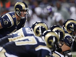
The most effective branding device in football is not a logo - it's the St. Louis Rams helmet with the curved horns on either side - turning the wearers into human battering rams, an entirely appropriate image for an aggressive football team. This is not a branding device apart from the players - it's an extension of their physical presence. Rams is a great name for a football team. That's what the line does - it rams into their opponents and opens up holes for charging backs. The horned helmet is a perfect visual metaphor, unifying name, image and player. A word that is derived from the sound it describes (such as zoom, bang, or beep) is called an onomatopoeia. The Rams' helmet has visual onomatopoeia. It's an elegant and impactful solution.
It's good branding when a team's name is evocative of the sport in which the team participates. There was an National Football League team in the 1920's called the Providence Steamrollers - an appropriate name for a football team, but in the 1940's when Providence joined the National Basketball Association the team selected that name, turning a fitting metaphor into an awkward fit. Basketball teams, hopefully, don't steamroll. The Chicago Bulls is another name more appropriate to football than basketball.
The range of logos and branding devices in the National Football League is fascinating. They range from the ultra-designed Cincinnati Bengals to the more basic old line teams like the Chicago Bears, New York Giants, Green Bay Packers, San Francisco 49ers, and others. The newer teams like the Carolina Panthers, Seattle Seahawks and the Jacksonville Jaguars have the most sophisticated logos and colors.
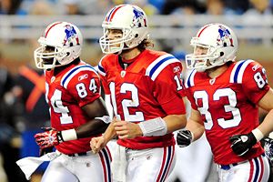
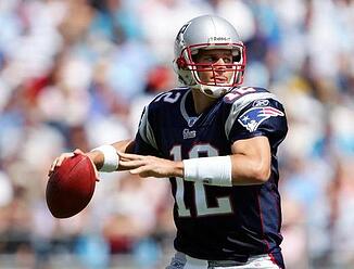
The New England Patriots are a candidate for the most-improved overall brand in the league. Their old uniforms were predominantly red, with touches of blue. This is strange when you consider that the real 18th century New England patriots were farmers and militia and their enemies were the ones who wore red. The continental army wore blue and buff. The original Patriots logo was a very literal illustration of a chunky patriot with a tri-cornered hat preparing to center a football. It had a comic book sensibility, and begged questions like "Why is that dude playing football in a tri-cornered hat, at center no less? Their new uniforms are dark blue and silver with red highlights. The new logo appears to depict a patriot with a hat that becomes a flowing star and stripes banner. The problem is that the gray face below the hat is forced into a triangular shape with an elongated head. They should lose the face and just go with the star and stripes banner. One assumes that the attempt was to simulate the blur that occurs as the helmet races past. It's not worth distorting the face to achieve this effect.
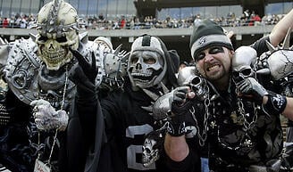
This leads to the problem of too-literal logos. Those logos with very illustrative personifications of the team name, such as the Minnesota Vikings and the Oakland Raiders look dated and trite. The Raiders' logo shows a football player sporting an eye patch (talk about blind-side!) and wearing a 1960's era helmet that fits his head like a glove. This needs to be updated or changed. Somehow though, the team has tapped into Oakland's motorcycle outlaw persona and has spawned a fanatic fan base, many of whom can be seen in their black and silver Halloween costumes and face paint in the stands at every game.
By far the most ludicrous logo is the fish with the helmet for the Miami Dolphins. The leaping dolphin is OK, but whoever put the tiny helmet on his head (if you can call that portion of his anatomy a head) went too far. This drawing would be dumb even for a Saturday morning kiddie cartoon, but as the symbol for a professional football team it's just embarrassing. Leave the dolphin, lose the helmet. The Dolphins, on the other hand, have a bright and very Floridian color scheme of aqua, bright orange, and white. They are probably the most distinctive team in the league, or at least they were before the circus came to town in the personages of the Cincinnati Bengals. The Bengals have a very strong visual presence and integrate the tiger imagery successfully from the feline-striped helmets to the black and orange uniforms. They are a bit over the top, but certainly a strong presence in which the brand resonates.
![]()
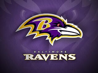
The Baltimore Ravens may be the only football team named for a poem. Their black, purple and gold uniforms stand out and the typeface used for the numerals is a cut above the ordinary. The logo is a raven's head, a little bit too cartoonish, but not that bad. It displays the requisite angry/determined expression. The name was chosen by a poll of the readers of The Baltimore Sun. Other names considered were Colts (where have we heard that name before?), Bulldogs, Marauders, and Americans.
Overall, the newer teams have more professionally designed brand identities than the tradition-bound older teams. A strong, positive brand can play a significant part in establishing a fan base - especially among younger people. The challenge for newer teams is to forge an identity that resonates with a city or region's history and that differentiates them from their competitors in a positive way.
In sports, as more and more teams are established, this becomes difficult. There are numerous lions, panthers, cougars, jaguars, bears, colts, eagles, falcons and rams. The Bengals, Ravens, Chargers, and Dolphins are fresher and more unusual. As sports become more international, new challenges will abound. Will we eventually have the Roman Gladiators and the London Hooligans? Only time will tell.
